


Mastering the Psychology of Colors in Brands for Marketing Impact
How do colors define the identity of a brand and influence consumer choices? The psychology of colors in brands is a critical element of marketing that can sway decisions and forge emotional connections. From the assertiveness of red to the calmness of blue, every color has a distinct psychological impact that can help a brand resonate with its audience. This article explores the strategic use of colors in branding, offering insights on aligning color choices with brand values to captivate and connect with target consumers.
Key Takeaways
- Color psychology is essential in shaping a brand’s identity, with specific hues signaling different emotions and brand values, thereby influencing consumer perceptions and behavior.
- Strategic alignment of a brand’s colors with its values, and considering the target audience’s demographic and cultural context, are vital for crafting an effective and resonating color strategy.
- Cultural nuances in color perception demand a global approach to branding, where the meanings and impacts of colors should be adapted to fit the specific cultural background of each market.
Unlocking Color Psychology in Branding
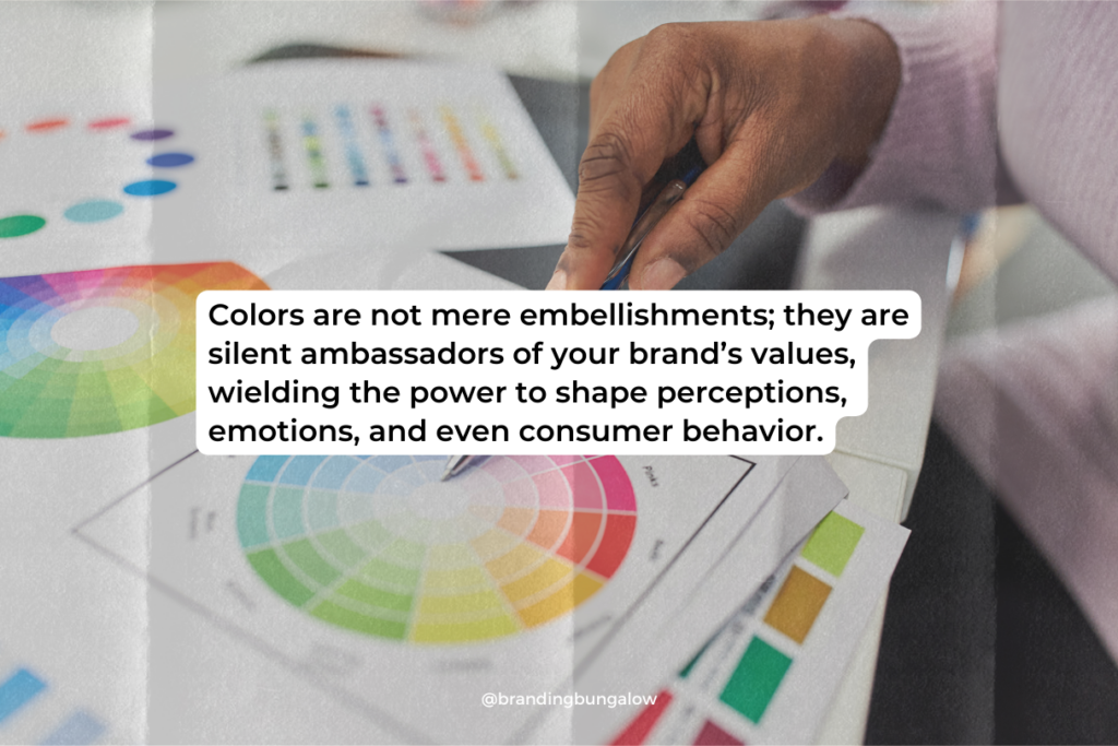
The interplay between color psychology and a brand’s identity is nothing short of alchemy. Colors are not mere embellishments. They are silent ambassadors of your brand’s values, wielding the power to shape perceptions, emotions, and even consumer behavior.
By understanding and applying the principles of color psychology, a successful brand can communicate its essence, stand out in a crowded marketplace, and forge a deeper connection with its audience, ultimately influencing its brand perception.
Understanding Color Psychology
Color psychology delves into how colors affect the human psyche by examining the influence of the color spectrum on various aspects of life, such as mood and appetite. For instance, while the color blue can signify trust and security, it may also suppress appetites and convey coldness in certain contexts.
Understanding these color associations allows brands to craft customer perceptions and tailor consumer behavior to their advantage. Doing so effectively shapes brand perception.
Colors and Brand Identity
At the heart of a unique brand identity lies the strategic use of color, which is one of the key branding strategies. Selecting hues that resonate with a brand’s personality and brand’s values amplifies its message and solidifies its standing in the consumer’s mind.
For example, the color red can energize and provoke action. This makes red a choice par excellence for brands like Coca-Cola, which thrives on exuding vibrancy and excitement.
The Impact of Color on Consumer Decisions
Colors can vastly influence purchasing decisions, significantly impacting how consumers perceive brands within mere seconds. The color red, often associated with urgency, is used effectively in sales promotions to encourage impulse buying.
Conversely, lighter colors may instill a sense of peace and trust. These colors potentially steer consumers towards a more contemplative and positive view of a brand.
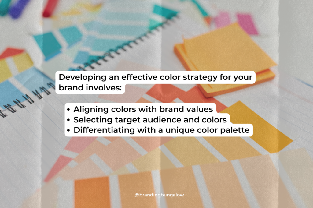
Crafting a Color Strategy for Your Brand
Developing an effective color strategy for your brand demands thoughtful consideration of your desired emotional impact and visual identity. Whether it’s the trustworthiness evoked by the color blue or the youthful vibrancy associated with orange, your chosen palette must align with your brand’s values and stand out in the minds of your audience.
Aligning Colors with Brand Values
Colors are not just seen; they’re felt. Aligning your color choices with your brand’s core values shapes the emotional response you seek to elicit from your audience. This could mean selecting serene blues to project tranquility or vibrant yellows to evoke optimism.
Personal branding, too, leverages color to reflect characteristics like expertise and reliability, which can impact a brand’s reputation.
Target Audience and Color Selection
Who you’re speaking to matters just as much as what you’re saying. Your target audience’s demographic and psychographic factors should guide your color selection, ensuring that your palette resonates with their personal preferences and cultural context.
For example, utilizing the energy of orange can appeal to a younger, more dynamic audience.
Differentiating with a Unique Color Palette
Standing out in a saturated market is a challenge that can be met with a unique color palette. Tech startups and smaller companies often opt for less conventional hues to signify innovation and set themselves apart from industry giants.
The Emotional Spectrum of Brand Colors
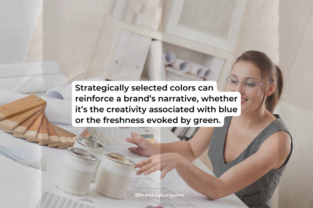
Each hue in the color spectrum serves as a key to unlock specific emotions and brand associations. Strategically selected colors can reinforce a brand’s narrative, whether it’s the creativity associated with blue or the freshness evoked by green.
The Warmth of Reds and Oranges
Reds and oranges are like the life of the party in the spectrum, radiating energy and warmth. These colors can stir up feelings ranging from affection to urgency, making them versatile tools in branding and marketing. Tech companies harness the power of red to denote innovation, while orange may be used by brands seeking to appear youthful and bold.
The Calmness of Blues and Greens
Blues and greens are the zen masters of the color world, offering respite and a breath of fresh air. Employed by brands like Whole Foods, green signifies growth and wellness, while blue is often used to convey a sense of tranquility and trust.
The Neutrality of Whites and Greys
White and grey stand as the canvas upon which other colors shine, embodying modernity and maturity. While white can create a sense of simplicity, grey can provide a backdrop of calmness and comfort.
Over 40% of technology leaders use white in their logos, pairing it with blue for a clean and contemporary aesthetic.
Cultural Nuances in Color Perception
As we broaden our horizons, we discover that color psychology is not a one-size-fits-all. Cultural nuances play a significant role in how colors are perceived, making the global branding landscape a complex tapestry of hues and meanings.
Color Meanings Across Cultures
The meaning of colors can vary dramatically across cultures, necessitating a nuanced approach for brands operating on a global scale. While purple might signify luxury in one part of the world, it can evoke entirely different sentiments elsewhere. Understanding these cultural differences is key to effective international branding.
Adapting Brand Colors for Global Markets
To ensure a brand’s message resonates universally, colors must be carefully curated to fit the cultural context of each market. This delicate balancing act is essential for maintaining brand consistency across borders.
Case Studies: Brands That Excel with Color Psychology
Case studies of brands that successfully employ color psychology offer a glimpse into the power of strategic color choices. These brands not only stand out visually but also connect with their audiences on an emotional level, showcasing their unique identities.
Tech Companies and the Color Blue

Blue reigns supreme in the tech industry, symbolizing reliability and innovation. Tech giants often choose blue to evoke feelings of trust and professionalism, a testament to the color’s versatile appeal.
Fashion Industry and the Use of Bold Colors
In the fashion industry, bold colors are a statement of creative expression and distinctiveness. Fashion brands like Versace use striking color juxtapositions to captivate and inspire, emphasizing the emotional impact of their designs.
Designing with a Psychological Edge
Designing with a psychological edge means understanding the subtleties of color psychology and leveraging them in branding to create a lasting impact. Through careful color choices, a brand can tell its story in a way that resonates deeply with consumers.
Logo Design and First Impressions
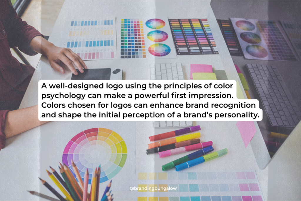
A well-designed logo using the principles of color psychology can make a powerful first impression. Colors chosen for logos can enhance brand recognition and shape the initial perception of a brand’s personality.
Marketing Materials That Resonate
The colors used in marketing materials are not just decorative—they’re communicative. By evoking specific emotional responses, colors can align with a brand’s message and capture the audience’s attention, making marketing efforts more impactful.
Navigating the Shades: Lighter vs. Darker Tones
Understanding the impact of lighter and darker shades is crucial for creating the desired tone and emotional resonance in branding. Whether aiming for sophistication or approachability, the right shade can make all the difference.
Lighter Shades and Approachability
Lighter shades are the welcoming embrace in the color world, often used to create a perception of friendliness and openness. They can help brands appear more accessible and encourage positive emotional connections with consumers.
Darker Shades and Sophistication
Darker shades exude an air of elegance and luxury, preferred by brands aiming to communicate a sense of exclusivity and high-end appeal. The use of black, for example, can signify sophistication and cater to a more discerning customer base.
Summary
In the kaleidoscope of branding, colors play a starring role, shaping brand identities and forging emotional connections that last. From the energy of reds to the sophistication of darker tones, every hue carries an emotional weight that, when strategically employed, can elevate a brand to new heights. Embrace the psychology of colors and let your brand’s true colors shine through.
Frequently Asked Questions
Can color psychology really influence consumer behavior?
Yes, color psychology can influence consumer behavior by evoking specific emotions that impact purchasing decisions. Research supports this idea.
How do I align my brand’s colors with its values?
To align your brand’s colors with its values, choose shades that resonate with the emotional impact you want and use color theory to create a harmonious palette. Then, test the effect on your target audience to ensure it aligns with your brand’s values.
Why do tech companies often use the color blue in their branding?
Tech companies often use the color blue in their branding because it conveys reliability, competence, and innovation, which are highly valued in technology and help establish trust with consumers.
How does culture affect color perception in branding?
Culture affects color perception in branding through diverse interpretations of color meanings, making it essential for brands to adapt their color schemes to align with local associations for consistent messaging across global markets.
What are the advantages of using lighter shades in branding?
Using lighter shades in branding can make a brand appear more approachable, friendly, and positive, which promotes openness and potentially increases customer engagement and trust.

Recent Blog Entries
Discounts to Dubsado CRM, Helcim Payment Processing and...
Brand audits can save your business' sinking marketing ship.
What's happening to Coke and what you can learn from it.
Shop Products
Create a personalize brand board by taking elements from our 3 signature brand board templates.


