


Creating a Powerful Style Guide for Branding: Tips & Examples
A style guide for branding is essential for maintaining consistency and conveying your brand identity effectively. In this article, we’ll explore what a style guide is, the key elements to include, and how to create one that accurately represents your brand.
Key Takeaways
- A brand style guide is an essential, evolving document that ensures brand consistency, aligns with brand identity, and assists in effective communication across all mediums.
- Key elements of a brand style guide include detailed guidelines for logos, color palettes, typography, brand voice, imagery, and iconography, ensuring a cohesive and recognizable brand presence.
- Creating an effective style guide involves regular updates, accessibility considerations, practical examples, and providing easily usable templates and assets to ensure that all brand representations are consistent and on-brand.
Understanding a Style Guide for Branding

A brand style guide is the compass that navigates the vast sea of branding decisions. It ensures each choice aligns with the visual and verbal identity of a company. At its core, a brand style guide is a robust rulebook that speaks to the essence of brand identity, offering clear brand guidelines for maintaining brand consistency. It’s the foundation upon which the entire brand is built and a critical tool for crafting a content marketing strategy that resonates with the target audience.
But, a style guide is not a static tome gathering dust on a shelf. It’s a dynamic, living document that grows alongside the brand, adapting to new chapters in the brand’s history and the ever-changing marketplace. Think of it as a curator of the company’s branding. It safeguards the heart of the brand—its brand voice—while allowing the creative team the flexibility to innovate within its pages.
The utility of such a guide cannot be overstated. It provides a shared language for internal teams and external partners, streamlining communication and minimizing the need for revisions. More than just logo guidelines or a list of font styles, it captures the company’s personality, distilling it into actionable directives that ensure brand consistency across all channels.
Moreover, regularly updating your own style guide is paramount. It ensures that as the company evolves, so too does its brand manual, preserving relevance and alignment with the brand’s voice and vision. By doing so, businesses create a brand that stands the test of time and forges a deep bond with their audience.
Key Elements of a Brand Style Guide
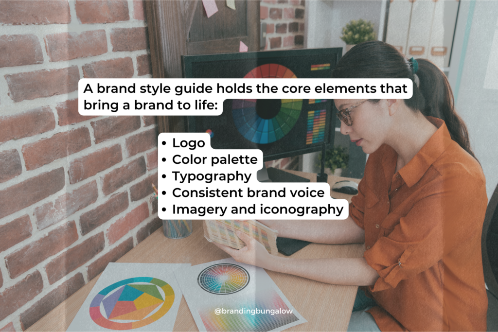
A brand style guide is akin to an artist’s palette. It holds the core elements that bring a brand to life. The logo, the linchpin of brand recognition, must have clear guidelines on usage and spacing to ensure it stands out in every context. Take Starbucks, for instance. Its iconic Siren logo and green color palette are meticulously outlined in its style guide to maintain its unique brand identity.
Similarly, the brand’s color palette is carefully curated. Designers often break down these palettes into primary, secondary, and neutral colors to convey the brand’s tone and values. Typography, too, plays a pivotal role, with font styles chosen to complement the brand’s voice and visual identity. The Royal Mail brand style guide, for instance, provides a great example of how to effectively combine these elements, from its logotype to the typography and vehicle livery.
Yet, it’s not just about the visual elements. The brand voice must be established and presented consistently across all mediums. Doing so encapsulates the company’s brand voice and ensuring it resonates with the target audience. Foursquare’s brand guide is an excellent illustration of this. It includes detailed instructions on the correct color palette and proper use of the logotype to maintain a consistent identity.
Lastly, imagery and iconography are the visual storytellers of a brand. They should be pre-defined to ensure high-quality and captivating visuals that align with the brand’s history and vision. For example, Sushi & Co’s brand style guide includes:
- Logo
- Color palette
- Typography
- Iconography/patterning
These brand elements allow for a rich tapestry of design elements that speak to the brand’s essence.
Crafting Your Brand Story
A brand story transcends mere words and visuals; it’s the emotional heartbeat of your company. It’s the narrative that weaves together values, vision, brand’s mission statement, and personality, setting the stage for the entire brand experience. When told effectively, it captures the essence of what makes your brand unique and why it matters. Doing so creates an indelible impression in the minds of your audience.
Think of your brand story as the first chapter of your brand book. It’s where the journey begins, inviting the audience to connect with your company’s personality and core values. This connection is not just beneficial but crucial in standing out in a crowded marketplace. A compelling brand story can be the deciding factor that tilts the scales in your favor.
In today’s fast-paced digital landscape, attention is the new currency. Brand storytelling emerges as a key strategy to capture the imagination and foster brand loyalty. It’s the narrative that informs every other aspect of your style guide, from the tone of voice to the choice of imagery, ensuring a cohesive and consistent brand identity.
To craft a brand story that resonates, begin by delving deep into the brand’s history and buyer personas. Explore the brand’s mission statement and values that underpin every action and decision. This story becomes the guiding light for your content marketing strategy. It is a beacon that ensures every campaign, every post, and every piece of marketing collateral is not just on brand, but also on message.
Logo Guidelines for Consistent Brand Recognition
Logos are the face of a brand, the visual shorthand that triggers instant recognition. Establishing clear logo guidelines is crucial for maintaining this recognition and ensuring the logo is used consistently. It’s the difference between a logo that becomes an icon and one that fades into obscurity.
For example, showing the construction of the logo in a brand manual allows designers and marketers to replicate the logo accurately, ensuring that no detail is lost in translation. Visual identity, including logo design, should be presented consistently. It’s these clear directions that facilitate up to an 80% increase in brand recognition.
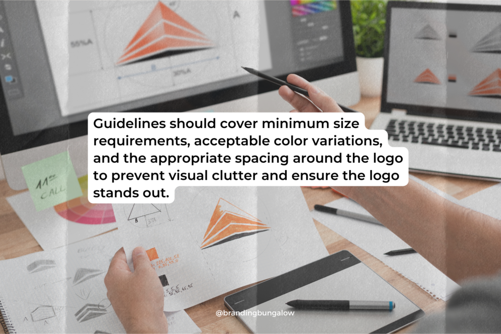
However, it’s not only about how the logo looks; it’s also about where and how it’s used. Guidelines should cover minimum size requirements, acceptable color variations, and the appropriate spacing around the logo to prevent visual clutter and ensure the logo stands out. Take, for instance, the secondary logos and supporting imagery captured in Barre & Soul’s brand style guide. Designers meticulously detailed each element to maintain the integrity of the brand’s visual identity.
In essence, logo guidelines are not just rules. They are blueprints for building a powerful brand image that resonates with the audience and remains ingrained in their memory. By providing visual examples of correct and incorrect logo usage, a brand style guide becomes a practical tool for anyone who interacts with the brand’s assets.
Defining Your Brand’s Color Palette
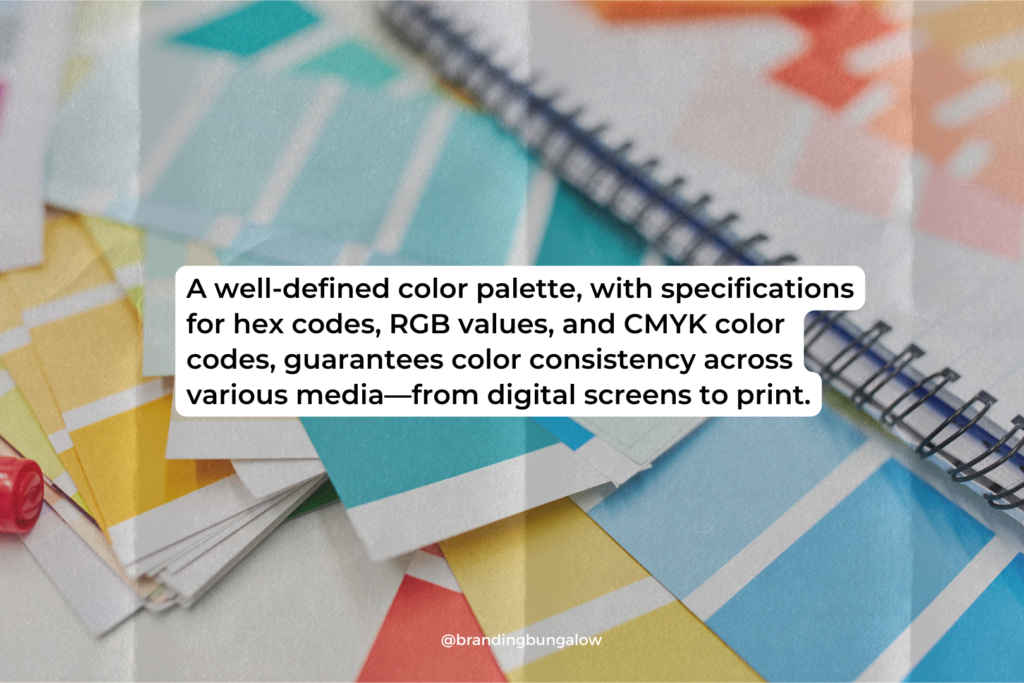
Color is a language that speaks before words ever do. A brand’s color palette is more than just a selection of hues. It’s a critical tool for conveying emotions and reinforcing brand identity. A well-defined color palette, with specifications for hex codes, RGB values, and CMYK color codes, guarantees color consistency across various media—from digital screens to print.
The strategic use of color can influence consumer behavior and perceptions. Red may draw immediate attention, while blue might invoke a sense of tranquility. This understanding of color psychology is pivotal when choosing the right colors for your brand. It ensures that they align with the desired brand tone and messaging.
For example, Trello’s brand guide takes color precision to another level with its Trellicolors tool. Trellicolors exports color palettes in a range of formats, ensuring the consistent use of every shade across all projects. Similarly, researching competitors’ brand colors can offer insights into how to stand out in the market.
Defining a brand’s colors is not just about picking favorites. It’s about crafting a mood board that tells a story, sets a tone, and creates an instantly recognizable visual identity. By including color schemes and combinations, along with practical examples of do’s and don’ts, the brand style guide becomes a beacon of consistency and a source of more inspiration for the creative team.
Choosing the Right Typography
Typography is the attire in which your words are dressed. Just like fashion, it sends a message before you say a word. Selecting font styles is critical, as they should mirror the brand’s identity and resonate with its values and positioning. Opting for timeless fonts over fleeting trends is advisable to ensure the brand remains relevant across the ages.
Readability is the cornerstone of good typography. The chosen fonts must be legible across various media, devices, and sizes to ensure that the message is not only seen but understood. For instance, fonts with a high x-height, like certain sans-serifs, are robust and clear even at smaller sizes. This makes them suitable for body text and digital interfaces.
Font pairing is an art that involves contrasting styles, such as serif and sans-serif, to create visual interest and hierarchy. Specifying font sizes and weights for different applications, from headers to paragraphs, can significantly enhance the brand experience. Clearly outline the use of font weights and sizes to guide the design of branded materials, ensuring consistency and sophistication.
Ultimately, the right typography should not just be pleasing to the eye but should also convey the right message. Licensing is a practical consideration, as having the rights to use a font is as important as the font itself. With these typography guidelines in place, a brand style guide ensures that every word typed is an extension of the brand. This consistency reinforces its identity and resonating with the audience.
Establishing Your Brand Voice
The brand voice is the distinct personality that speaks to the hearts of your audience. It’s what makes your business not just recognizable, but relatable. Establishing a consistent brand voice means crafting content that your consumers can trust. It builds a relationship that goes beyond transactions to genuine engagement.
Your brand voice should be a direct reflection of your company’s brand identity and core values. Whether it’s authoritative, whimsical, or somewhere in between, the company’s brand voice can adapt to different messages and marketing outlets while staying true to the underlying brand identity. For example, while the brand tone might shift from playful on social media to more formal in a white paper, it should consistently embody the company’s personality.
Surveying your target audience is an insightful way to fine-tune your brand tone. By understanding their preferences and perceptions, you can shape a brand voice that resonates with them on a deeper level. Including a writing sample that exemplifies the brand’s voice in the style guide can serve as a benchmark for all communication. These benchmarks ensure that every word is on brand.
However, language is fluid, and so too should be your brand voice. Regularly reviewing and adjusting the brand voice ensures it stays relevant and resonant. It should keep pace with cultural shifts and evolving vocabulary. When your brand voice is both consistent and current, it becomes a powerful tool for connecting with your audience and reinforcing your brand identity across all channels.
Incorporating Imagery and Iconography
Visuals speak volumes, and in the language of branding, imagery and iconography are the alphabets. Incorporating these elements into your brand style guide ensures a cohesive brand presence that captures attention and communicates your message effectively. Detailed guidelines for imagery and iconography help steer the brand’s visual content in the right direction, providing clarity and consistency without the need for constant oversight.
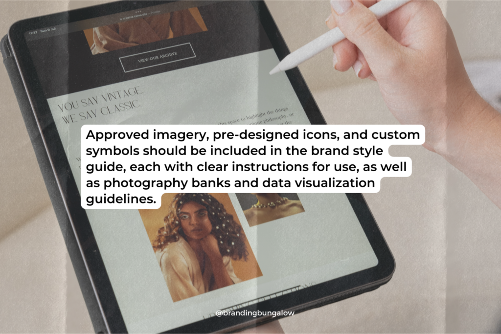
Approved imagery, pre-designed icons, and custom symbols should be included in the brand style guide, each with clear instructions for use. These visual elements are the building blocks of your brand’s visual identity, and their consistent use across all brand collateral is key to maintaining a unified look and feel.
Photography banks and data visualization guidelines are practical resources to include in the style guide. They provide a repository of the types of images and graphics that align with the brand, as well as where to find them, streamlining the design process and ensuring a consistent aesthetic. Providing visual examples of these elements in action offers even more inspiration and guidance to the creative team, helping to maintain the brand’s visual integrity.
In essence, imagery and iconography are not just decorative elements; they are the visual storytellers of your brand. By embedding these guidelines into your brand book, you ensure that every piece of visual content—be it an advertisement, a social media post, or a product packaging—tells a part of your brand story, reinforcing your identity and connecting with your audience on a visual level.
Practical Examples of Brand Style Guides
Learning from the best can offer invaluable insights into creating a compelling brand style guide. Brands like Trello, Heineken, and Spotify serve as concrete examples of how different companies approach their own style guides to maintain consistency and recognition across a variety of mediums.
Trello’s brand style guide, for example, is a testament to user-friendliness and accessibility. By making their guide available as a public web page and providing all logos and assets in a variety of formats, Trello ensures that anyone can represent their brand correctly, be it in PNG, EPS, SVG, or Sketch format. Similarly, Spotify focuses on logo variation and album artwork, providing color codes and downloadable icon versions to maintain its brand identity.
Heineken’s style guide is a great example of a brand staying true to its roots, arranging guidelines within a gradient of its signature green to maintain its brand identity.
The Western Athletic Conference’s guide goes a step further, including extensive information about its:
- history
- mission
- vision
- member universities
- athletic championships and awards
These practical examples demonstrate the diversity and adaptability of brand style guides. From Trello’s platform-agnostic approach to Heineken’s iconic green gradient, each big brand utilizes its style guide to ensure they present their visual and verbal identity consistently, no matter where or how it is encountered.
Tips for Creating an Effective Style Guide
Creating an effective brand style guide is a strategic process that requires attention to detail and a deep understanding of your brand. To ensure that no critical elements are left out, it’s important to cover all bases and keep the manual detailed and comprehensive. The rules within should be easy to follow, enabling anyone working with the brand to replicate them accurately and effortlessly.
Keep in mind that a brand style guide is not a static document; it’s a living entity that must evolve with the brand and the market. Regular reviews and updates to elements like logo guidelines and color schemes ensure that the brand remains fresh and relevant. Incorporating brand guidelines templates, mood boards for different content types, and creating easy-to-use branded templates are additional ways to ensure consistent and cohesive branding across all touchpoints. To create brand guidelines that truly reflect your brand’s identity, it’s essential to keep these factors in mind.
Accessibility is also crucial in today’s inclusive environment. Meeting standards ensures content is accessible to all users, including those with visual impairments. Tools like Google Slides are useful for presenting the brand guide in a format that’s easy to navigate and understand, streamlining the process for those who use it.
Ultimately, the goal is to empower the team to easily design branded assets that are on brand. By providing downloadable assets, templates, and a single source of truth for brand colors, you make it easy for the team to create content that aligns with the brand identity, ensuring consistency and reinforcing the brand’s presence in the market.
Summary
Embarking on the journey of branding, we’ve traversed the landscape of style guides, from understanding their purpose to dissecting their key components. We’ve explored the art of storytelling, the science of color psychology, the precision of logo design, and the subtleties of typography. We’ve heard the distinct voices of brands and seen through the lens of their visual identities. Through practical examples and actionable tips, we’ve learned that a brand style guide is more than a document—it’s the embodiment of a brand’s soul. Let this be the canvas on which you paint the future of your brand, a future marked by consistency, recognition, and an enduring connection with your audience.
Frequently Asked Questions
What is a brand style guide?
A brand style guide is a comprehensive manual that outlines a brand’s visual and verbal identity, ensuring consistent messaging and branding across all channels. It includes elements like the logo, color palette, typography, and brand voice.
Why is brand consistency important?
Brand consistency is important because it helps build recognition and trust among your audience by ensuring that the brand is easily recognizable and that the messaging aligns with the brand’s values and personality. This, in turn, can increase brand loyalty and customer engagement.
How often should a brand style guide be updated?
A brand style guide should be updated regularly to ensure it stays relevant and reflects any changes in the brand’s identity, values, or market position. It is a living document that evolves with the brand and requires frequent reviewing to maintain its effectiveness.
Can the tone of a brand voice change depending on the context?
Yes, the tone of a brand voice can change depending on the context and medium, while still maintaining consistency with the overall brand personality.
What are the benefits of using branded templates?
Using branded templates ensures consistency and professionalism across all brand communications, simplifying the content creation process for the team.

Recent Blog Entries
Discounts to Dubsado CRM, Helcim Payment Processing and...
Brand audits can save your business' sinking marketing ship.
What's happening to Coke and what you can learn from it.
Shop Products
Create a personalize brand board by taking elements from our 3 signature brand board templates.


